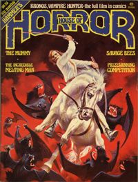
In our mammoth editorial sessions, Dez taught me the rudiments of how covers are put together. It had never occurred to me that cover lines should not only sell the magazine to the casual browser, but they should also line-break where the natural pauses would be when you read them aloud. This applies to captions and cross-headings as well.
Dez always maintained that if you could get the casual browser in the newsagent shop to open the magazine, then you were halfway to a sale. So we always tried to make the potential customer curious about what the cover line on the outside referred to on the inside of the mag.
I should also mention that we were spoiled on House of Hammer because we had the luxury of having covers painted by some of the top artists in the business. This also meant that we could ensure that appropriate "dead areas" were left where we could put cover lines as we prepared the cover for publication.
The artist on 90% of the magazine's covers was Brian Lewis, an immensely talented artist who could turn his hand to any kind of illustration.
Brian also provided the artwork for the adaptations of some of Hammer's best remembered films. His first strip was in
HoH4, "Legend of the 7 Golden Vampires".
Then "Moon Zero Two" in
HoH5 and the two-parter "The Quatermass Xperiment" in
HoH8 &
HoH9.
The features in
HoH were always so much more than just padding (unlike the articles in the later black and white mags published by Marvel US) and we had some great writers - Tony Crawley, Alan Jones and Phil Edwards - who'd also feature large in the history of
Starburst, a magazine I was to edit for six years.
So after I'd been at
House of Hammer for about ten months, it seemed like a good time to be moving along. But I would work with Dez again ... and sooner than I would have thought.
