 |
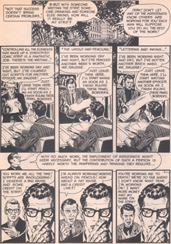
One of the truly great artists from the EC Comics era, Al Wiiliamson also did some terrific work for Warren Comics in the 1960s. This knowing spoof of the comics biz uses repeating panels to great effect, years before anyone else did it. |
 |
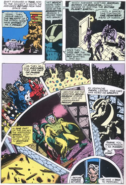
Writer/artist Jim Starlin always pushed the boundaries of what comics could achieve, and was responsible for some brilliant work during the 1970s, on both the cosmic Captain Marvel and Warlock. |
 |
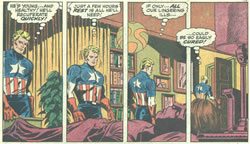
The douty Jim Steranko used this kind of split panel technique to give an almost stroboscopic effect. It can be used in exactly the same way a film-maker uses slow motion, to stretch out an emotional moment |
 |
Eerie 13 (1965)

The comic effect of the three scenes unfolding in exactly the same way is even funnier if you know that the characters in the story are drawn to look like Warren staffers.
|
|
Capt Marvel 33 (1975)

Here Starlin uses some odd geometric panel shapes to tell his story for no reason other than it looks good and it's different. |
|
Capt American 110 (1968)

This is an immensely memorable scene and it's no surprise that I could remember exactly where to find it when I was researching images for the book. |
|
