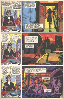
The technique of parallel narrative only works if there's a real need to show simultaneous scenes. But symetrical layouts can be used as in these examples from Watchmen, by Alan Moore and Dave Gibbons. From reading the story, it's quite apparent that Moore and Gibbons had discussed the techniques. The trick of laying dialogue from one scene over the visuals for another has long been a trademark of Moore's work. Another take on th symetrical page, an ingenious use of page layout for dramatic effect, Neal Adams would often create graphically clever page layouts that simply made reading comics a good deal more fun.
     
Watchmen 3 (1986)


The repetition of the panel arrangemnt down the page with the monologue from the left side of the page overlapping the visuals on the right of the page is classic Moore.
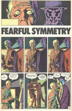
  Watchmen 5 (1986)


This layout give Gibbons the limelight. The symetry of Rorschach's mask is echoed in the symetry of the page layout and makes for an effective dramatic sequence.
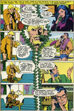
  GL / GA 87 (1971)


There's no end of this kind of clever page layout in comics and Neal adams was certainly, along with Jim Steranko, one of the pioneers.
 
           
<< Previous Page  
Click the image to see an enlargement
  Next Page >>  
     
 
Copyright © 2020 The Story Works | Contact | Other sites hosted by TheStoryWorks