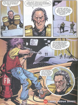
There's endless ways of laying out the page to enhance the story. The only limit is the imagination. But some good rules of thumb are that important scenes should be drawn larger to increase their impact. You can take a central image, say a human figure, and work the rest of the page design around that. Brian Bolland used this to great effect in some of his classic Judge Dredd stories for 2000AD. But sometimes you just have to let the action dictate the design. That may mean no flashy design, but the story and your drawing of it should be strong enough without it. Design is an enhancement of the page not the reason for it.
     
2000AD 881 (1994)


In this page from the Judge Dredd story "The Manchu Candidate" the single most important scene is the dweeby assassin aiming his gun at the Chief Judge. The inset panel shows us what the killer sees through the scope of his rifle, which involves the reader in the action.
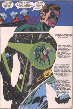
  GL / GA 81 (1971)


Here star artist Neal Adams builds the entire page around a large figure of Green Lantern. It's a clever and eye-catching design.
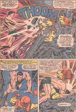
  Tales to Astonish 82 (1966)


And when the drawing is as strong as this, who needs clever-clever design. Jack Kirby lets his pencils show the way to the layout.
 
           
<< Previous Page  
Click the image to see an enlargement
  Next Page >>  
     
 
Copyright © 2020 The Story Works | Contact | Other sites hosted by TheStoryWorks