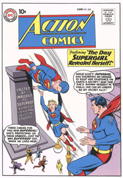
The absolute king of lettering at DC was the legendary Ira Schnapp. He was responsible for the cover lettering that appeared on most DC covers and many DC house ads for thirty years. All the lettering on this cover is Schnapp's, including the iconic Action logo and the Comics Code stamp ...
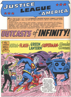
Once Schnapp retired from DC in 1969, Gaspar Saladino took over as DC's principle cover and logo letterer. Saladino's lettering style was more dynamic and less precise than Schnapp's, but that's what icoming publisher Carmine Infantino was looking for. Saladino is best known for his logos for Metal Men and Swamp Thing.
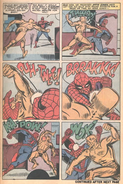
Artie Simek had been a staff letterer at Timely in the 1940s and later lettered both Fantastic Four 1 and Amazing Fantasy 15. Despite Stan's occasional mocking, Simek was sometimes allowed to letter an entire page of sound effects, like this.
Click the image to see an enlargement
Copyright © 2020 The Story Works | Contact | Other sites hosted by TheStoryWorks