Though contemporary comic artists seem to be obsessed with detail, the old-timers take the approach of "What is enough?". The generation who learnt their craft in the 1940s have a great deal to teach us. | A glance through the DC comics of the 1960s, show that revered artists like Gil Kane and Carmine Infantino, rarely cluttered up their panels with detail. Sometimes they didn't even bother with backgrounds. | Yet for all that, their stories were told splendidly. No reader ever wonder where the story was taking place or what was going on. It was perfectly clear from the outset. Here we'll look at how this was achieved. | ||||
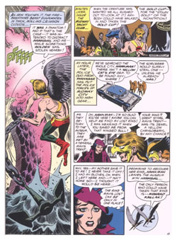
Brave and the Bold 36 (1964) DC veteran Joe Kubert somehow always manages to produce dazzling artwork that isn't over-laden with detail - on the contrary, his art is quite minimalistic, but no less effective for that. Note how real Hawkman's face is in the fourth panel. |
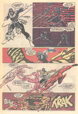
Daredevil 170 (1981) Here, Frank Miller drops the background behind villain Bullseye to create and impact and make Bullseye's attack the focus of the page. |
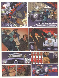
Hard Boiled 2 (1989) Geoff Darrow is the King of Detail. In Hard Boiled, every last tin can and candy wrapper is drawn in the litter around the hero's feet, every last speck of blood in the third panel is lovingly rendered. |
||||
<< Previous Page | Click the image to see an enlargement |
Next Page >> | ||||
Copyright © 2020 The Story Works | Contact | Other sites hosted by TheStoryWorks |