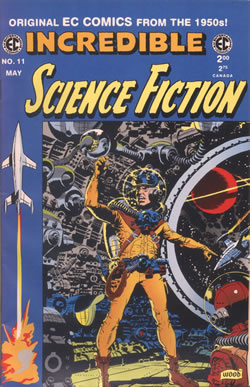
Although it's easy to think of comics from bygone decades as having more simplistic art than today, this is not always the case. For example, the EC comics artists always turned in complex and sophisticated art. But it is fair to say that comics of the 1950s and 1960s we created very much with the ten year old reader in mind and as such featured artwork that served the story rather than art for art's sake, as it seems in more recent offerings. That said, the artists who'd come up through the Golden Age had developed their skill to the point where they were able to suggest great complexity, even if it wasn't actually there on the page ...
     
Incredible SF 11 (1954)


Wally Wood's backgrounds were very much a trademark of his science fiction art for EC.
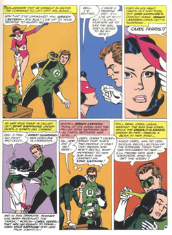
  Green Lantern 26 (1963)


Gil Kane was a master of the human figure, but in this example, there is not one panel with a background to be seen. However, that doesn't detract from the story being told - if anything it focuses the reader's attention on the foreground action.
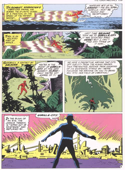
  Flash 107 (1960)


Kane's stablemate at DC, Carmine Infantino, was a master of suggestion. Whereas a modern artist would draw Gorilla City in loving and intricate detail, Infantino deftly suggests a vast city with a few sketchy lines. And check out the "foliage" in the 4th panel.
 
           
<< Previous Page  
Click the image to see an enlargement
  Next Page >>  
     
 
Copyright © 2020 The Story Works | Contact | Other sites hosted by TheStoryWorks