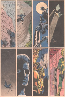
Marvel's Jim Steranko always pushed the boundaries, and often used visual effects like "fish-eye lens" and forced perspective in his strips. Using extreme perspective always brings a sense of depth to 2D artwork. Neal Adams and Steranko were always leapfrogging each other in an effort to take comics art to the edge. But Adams probably had the advantage here with his photo-real drawings of the human figure. Then came Alex Ross, with the remarkable series The Marvels, which showed superheroes from the point of view of the ordinary citizen of New York and made us feel as if titans walked among us (or perhaps above us).
     
SHIELD 1 (1968)


This "silent" page uses just about every visual trick in the book - extreme foreshortening, birds-eye views, chiaroscuro - it's like a "how-to" catalogue.
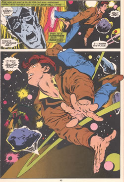
  Avengers 96 (1972)


Adams uses extreme perspective here to communicate Rick Jones' disorientation as he emerges into a weird alternative universe. Note how the character's feet break out of the panel to give a sense of 3D.
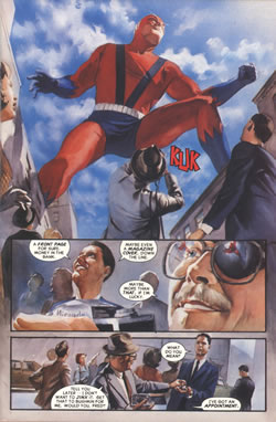
  The Marvels 2 (1994)


Never has anyone drawn Giant Man more convincingly than Ross did in The Marvels. It's the closest you're going to get to actually experiencing Giant Man stepping over you.
 
           
<< Previous Page  
Click the image to see an enlargement
  Next Page >>  
     
 
Copyright © 2008 The Story Works | Contact | Other sites hosted by TheStoryWorks